
Do you want to create a high converting landing page that is not just eye-catching, effective but captures attention and drives results as well? Then, you’re in for a treat! Here we’re going to break down the art of designing a fantastic landing page.
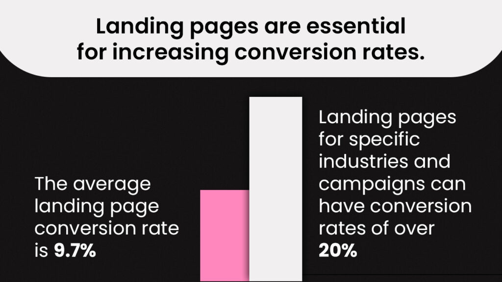
Landing pages are a critical component of any successful online marketing campaign. They serve as the gateway to your brand, product, or service and are often the first point of contact for potential customers. A well-designed landing page can make all the difference between a casual visitor and a loyal customer.
Let’s Learn How to Make a Converting Landing Page!
What is a Landing Page?
A landing page is a single web page designed for a specific purpose, such as marketing a product or service, collecting user information, or prompting a particular action, like signing up or making a purchase. It’s typically separate from a website’s main pages and is optimized to drive visitors toward a specific goal, often featuring compelling content, a clear call to action, and elements aimed at converting visitors into customers or leads. It’s the first thing people see when they click on a link from an email or an ad.
Making an Effective Landing Page
Do you want more people to visit your website and take action, like signing up or buying something? Well, you’re in luck! We’re going to talk about making a super cool landing page that will make people excited to visit your site and do what you want them to do.
Compelling Headlines:
The first thing visitors see should grab their attention immediately. Craft a headline that is clear, concise, and addresses the visitor’s needs or pain points.
Engaging Visuals:
Incorporate eye-catching images, videos, or graphics that resonate with your audience and help convey your message effectively.
Clear Call to Action (CTA):
Your CTA is the heart of your landing page. It should be prominently placed and use persuasive language that compels visitors to take action, whether it’s signing up, making a purchase, or requesting more information.
Concise Copy:
Keep your text concise and to the point. Use persuasive and benefit-oriented language to highlight what’s in it for the visitor.
Social Proof:
Showcase testimonials, reviews, or case studies to build trust and credibility. People tend to trust the opinions of others who have had a positive experience with your product or service.
How to Find Landing Pages
People find landing pages through things called keywords and by searching on the internet. Landing pages are super important because they help turn visitors into new friends or customers. So, how you make them look is very essential!
- Use Search Engines: Search for specific keywords or phrases related to the product or service you’re interested in. Advertisers often create landing pages to target specific search terms.
- Visit Ad Campaigns: Click on online ads, such as Google Ads or social media ads. These often lead to landing pages designed for those ad campaigns.
- Explore Email Marketing: Companies frequently include links to landing pages in their marketing emails, promoting offers or products.
- Social Media Links: Companies share landing pages on their social media profiles, especially when running promotional campaigns.
- Competitor Analysis: Analyze competitors’ websites and marketing materials. They may provide insight into effective landing page strategies.
6 Tips for a Converting Landing Page
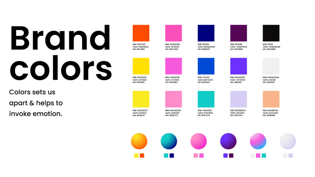
Use Your Brand’s Colors
When you create a special webpage, like for your business or things you like, try using the same colors that you use on your social media. Colors can make people feel different emotions. For instance, the color blue can make people feel relaxed and like they can believe in what they see. So, using the same colors on your webpage and social media helps people recognize your stuff and feel comfortable with it.
Easy-to-Read Fonts
When you’re writing something for others to read, it’s good to use fonts that are easy to understand. Fancy and tricky fonts might look cool, but they can make words hard to read. So, it’s better to choose simple fonts that make your words clear and easy to see.
Don’t use fancy, hard-to-read fonts. Simple fonts are the way to go. For instance, you can use a white font on a blue-green background, making it easy to read and hard to miss.
Add Pictures and Cool Graphics
Pictures and graphics are like magnets for our eyes. We love looking at them! So, use high-quality images that show off what you’re all about. If you’re selling something, show pictures related to it. If you’re offering a service, use images that show how helpful it is.
So, when you’re making something like a website or a poster, it’s better to use really nice pictures that help tell your story. Pictures and graphics make it more interesting and show people what you’re all about.
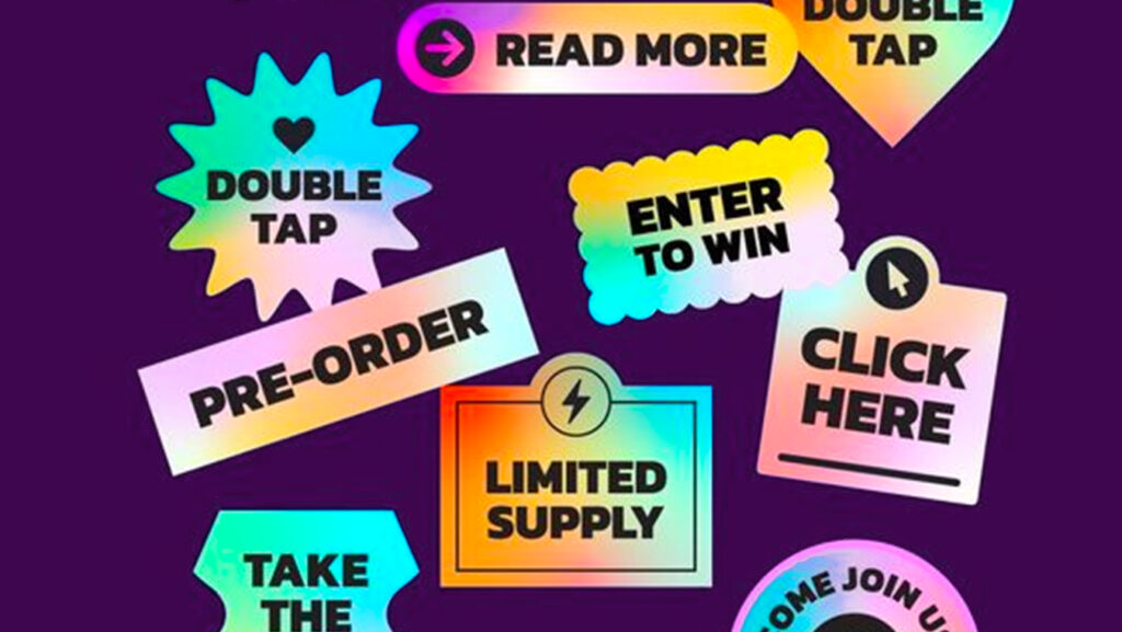
Have a Clear CTA
Don’t let people get lost on your landing page. Make sure they know what to do next. Use catchy headlines and subheadings to grab their attention and explain what you’re all about.
Think of a Clear Call to Action (CTA) as the most important part of your landing page. It’s the message that tells your visitors what you want them to do, and it’s super crucial.
Imagine you have a sign that says, “Join our club!” That’s a CTA. Or it could be something like “Buy now” if you’re selling something cool. Your CTA should stand out on your page, like a big, colorful button or a noticeable text. And the words you use should be really convincing, like saying, “Get started today for amazing benefits!” It’s like giving your visitors a clear path to follow, whether it’s signing up for your newsletter, buying a product, or getting more information. So, a CTA is like the guide that helps your visitors take action and do what you want them to do on your page.
Keep It Simple
Don’t clutter your landing page with too much stuff. Keep it clean and organized. Too many things can confuse people. A clear Call to Action (CTA) is like a bright sign that tells them where to go next.
“Less Is More” means that sometimes, having less stuff on your landing page is actually better. It helps visitors know exactly where to go next, like signing up for your newsletter or buying something from your website. So, keeping your landing page simple and having a clear CTA is like giving your visitors a clean path to follow and making things easier for them.
Mobile Phone’s Optimization
Don’t forget about people who visit your site on their phones. Make sure your landing page looks good on mobile devices because most of us use our phones to browse the internet.
“Mobile Phone’s Optimization” means you should make sure your website looks and works well on smartphones. That’s because a lot of people use their phones to go on the internet.
So, when you optimize your landing page for mobile phones, it’s like making sure that book has big, clear letters that are easy to read. This way, when people use their phones to visit your website, it looks nice and works smoothly, just like it does on a computer. It’s important because you want everyone to have a good experience when they come to your website, whether they’re using a phone or a computer.
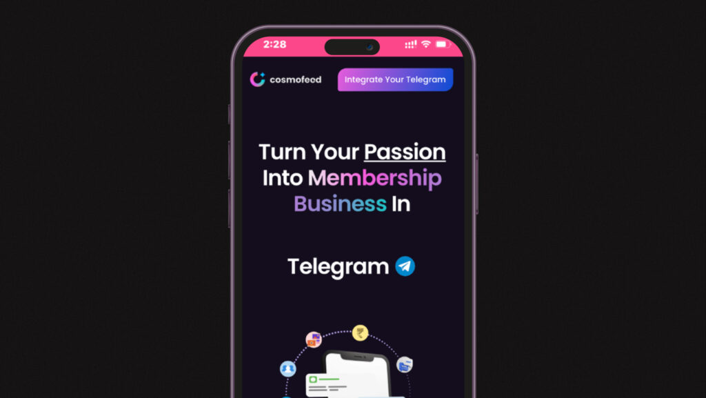
Check Out Cosmofeed!
If you want to make a fantastic landing page, try using Cosmofeed. You can customize it easily and make it highly converting and effective at the same time.
Thousands of creators love Cosmofeed, and you might too!
Conclusion
When making a landing page, remember to be friendly and helpful. Make people feel welcome, and they’ll want to spend more time with you and your content. Building online relationships is super important!
By using your brand’s colors, choosing readable fonts, adding stunning graphics, and making your call to action crystal clear, you’re well on your way to designing landing pages that’ll captivate your audience. Keep things simple and mobile-friendly, and you’re sure to build strong online relationships.
And if you’re eager to take your web design skills to the next level, don’t forget to check out Cosmofeed! It’s a fantastic tool that can help you build an amazing landing page with ease.